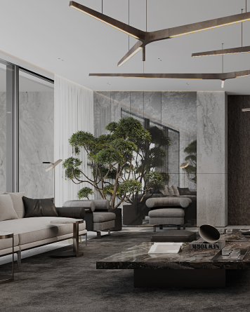
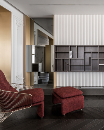
Brand Identity + UX/UI Experience
[email protected]IQOSA


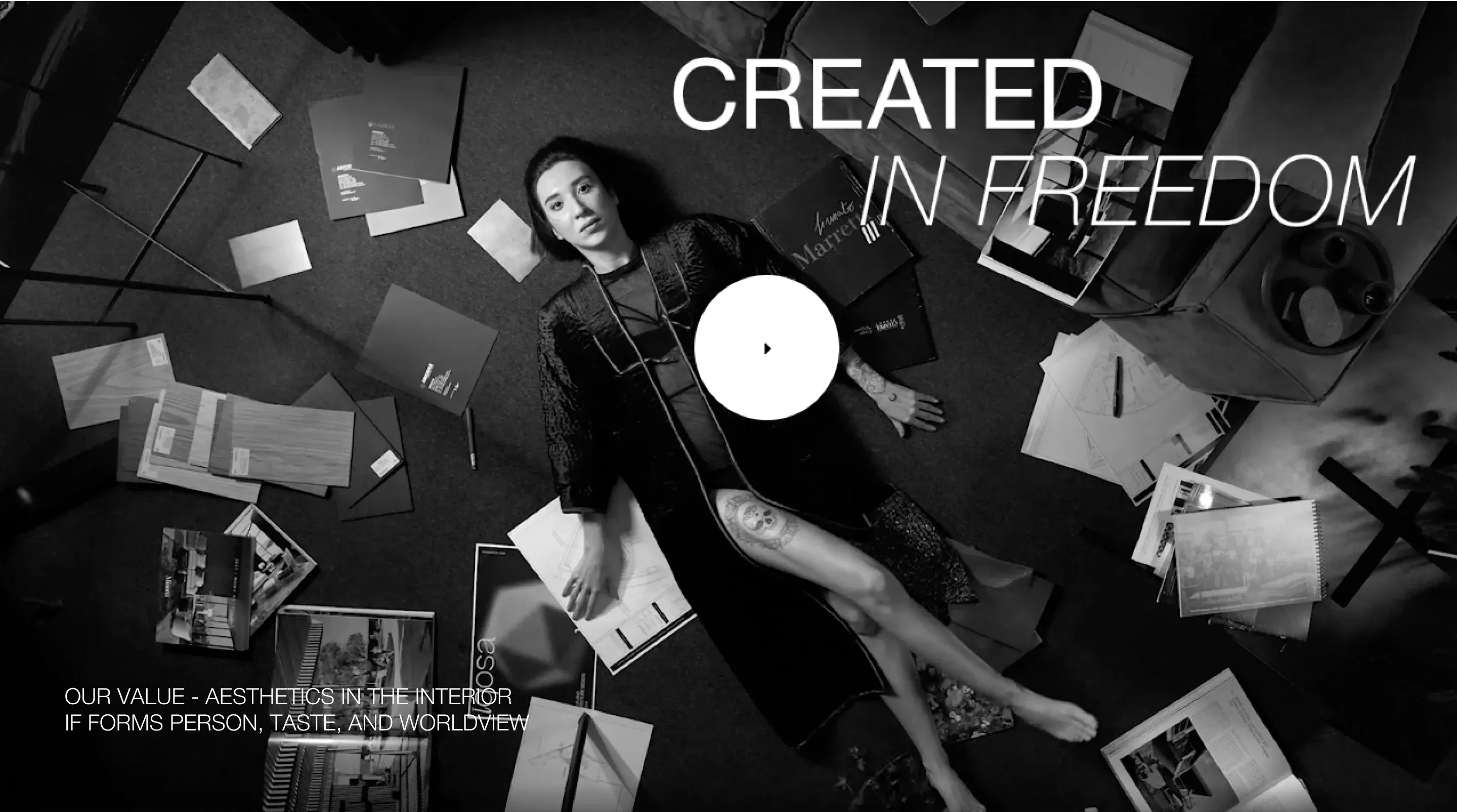
The aesthetics in the interior, for the interior, can form a person, a taste and a particular worldview.
Logo + Brand Identity
+ UX/UI + Website Development →
Yes, Seriously!
The quality of life
by the quality of implementation
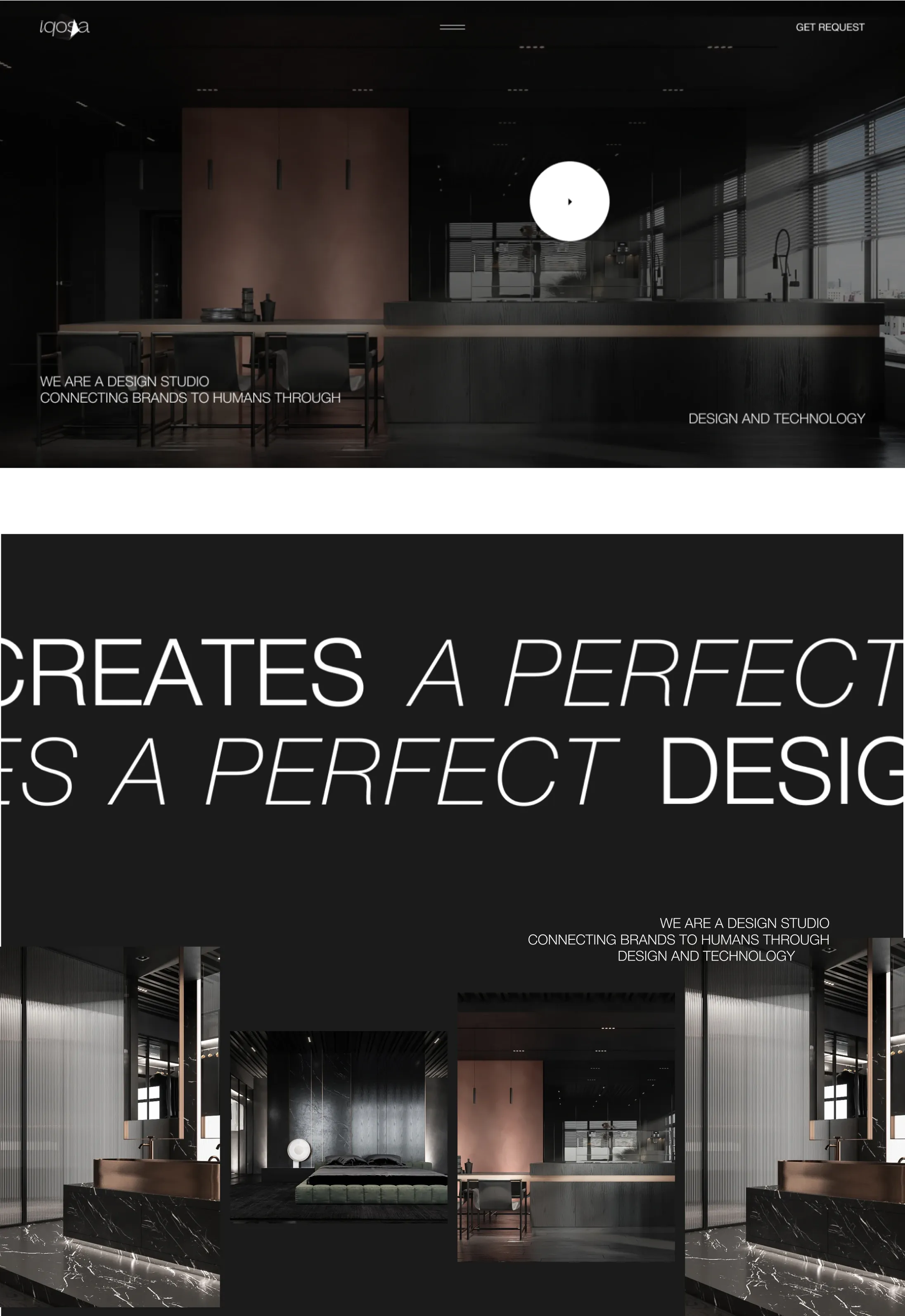
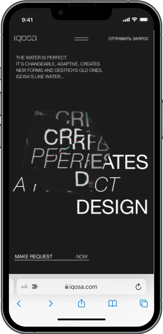
We developed a 3D-icosahedron element that breaks all the inscriptions below it on the main page of our site. The an interactive figure was created using WebGL. Despite this, we have achieved a fast loading site.
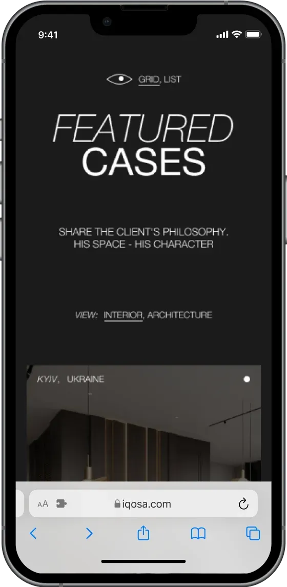
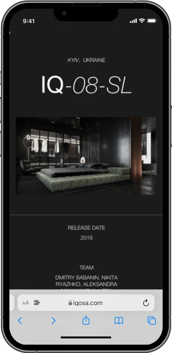
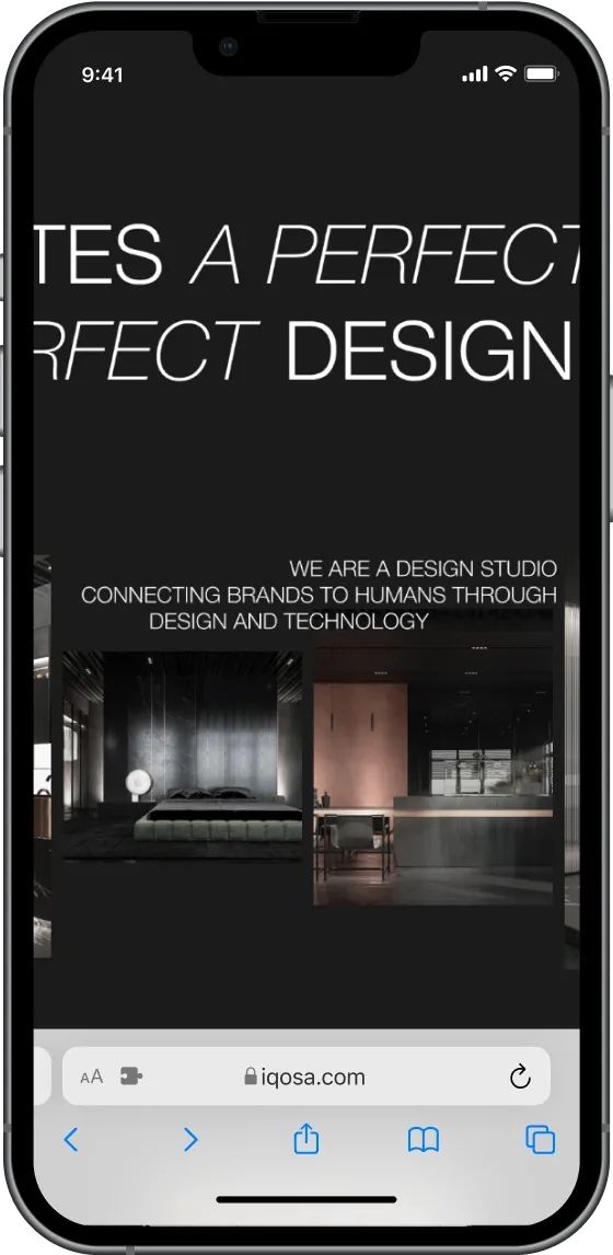
The project's page features two types of display: a list for quickness and a full screen to see the details.
The page of one project boasts a seamless transition to the next project, using animation to expand the image to the desired size.
No more words, you must see it with your own eyes.
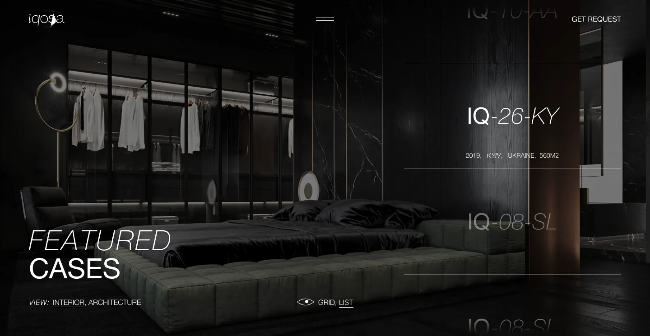
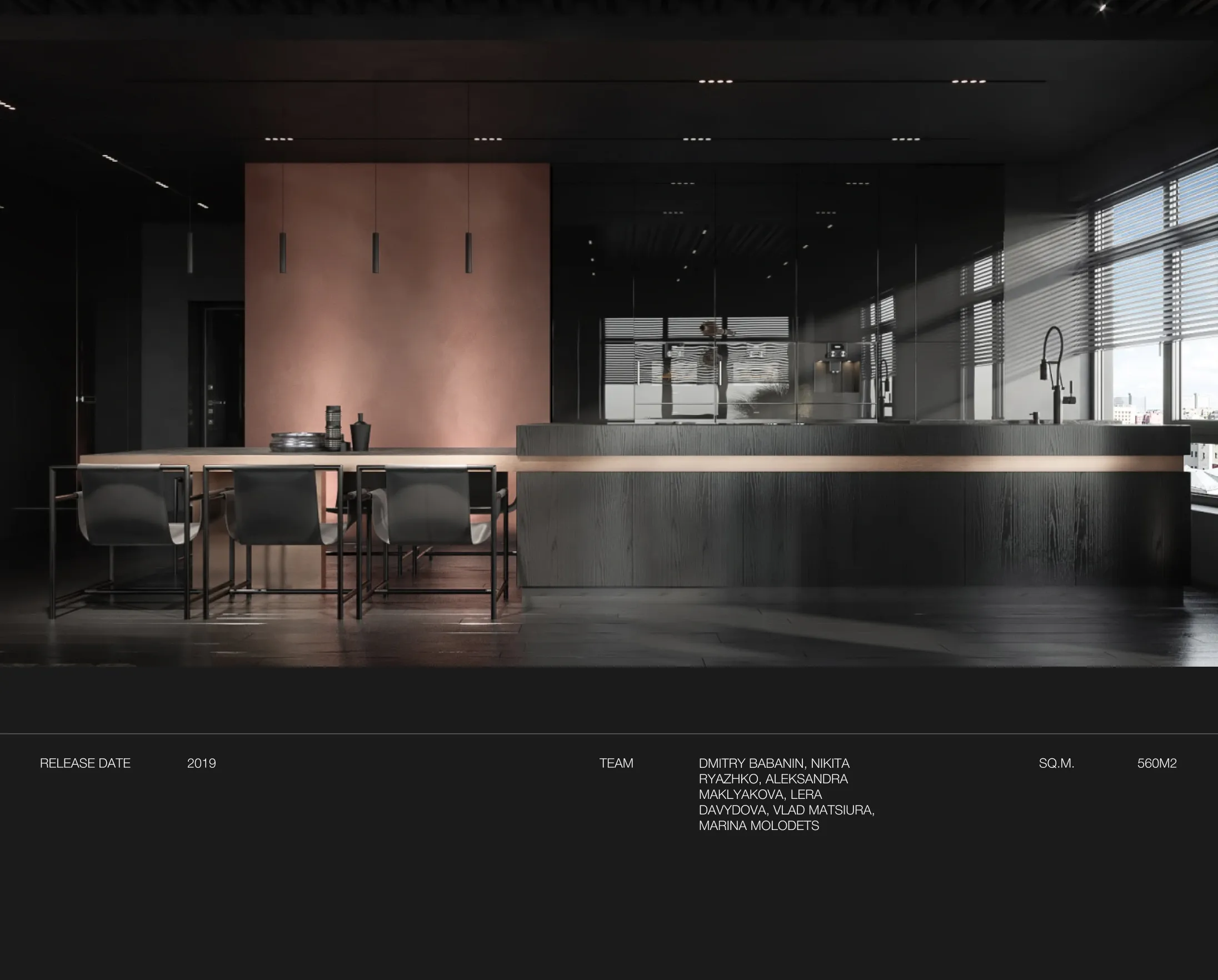
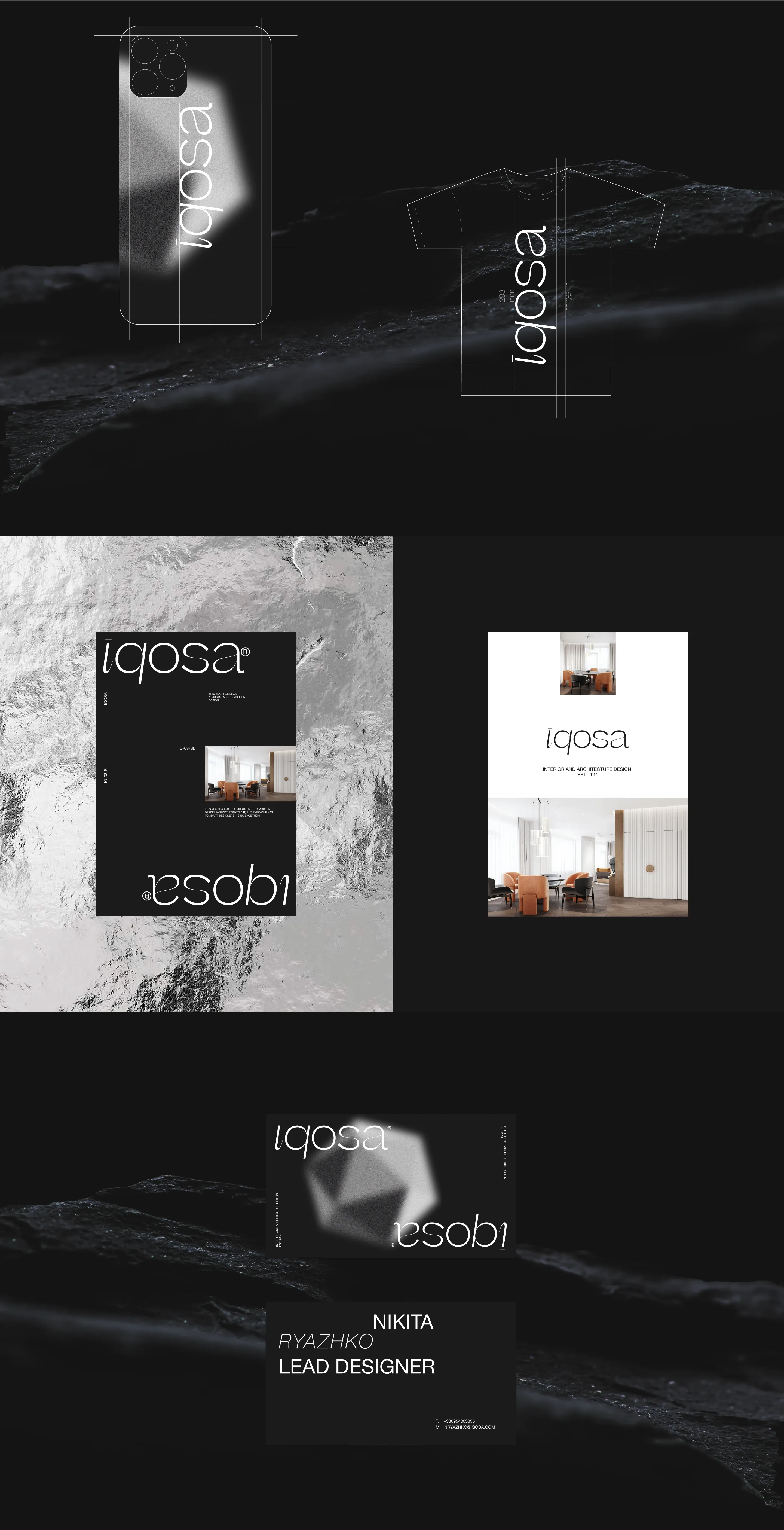
The logo was designed in lower case, and the absence of capital letters is meant to be consistent with elegance.
At the heart of branding, we created a concept that uses one font, but with two styles: regular and italic. We also developed social media profiles, merchandise for the team, and materials to give clients.
