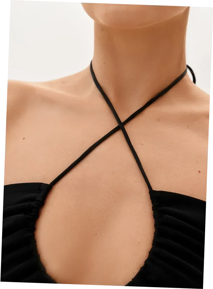
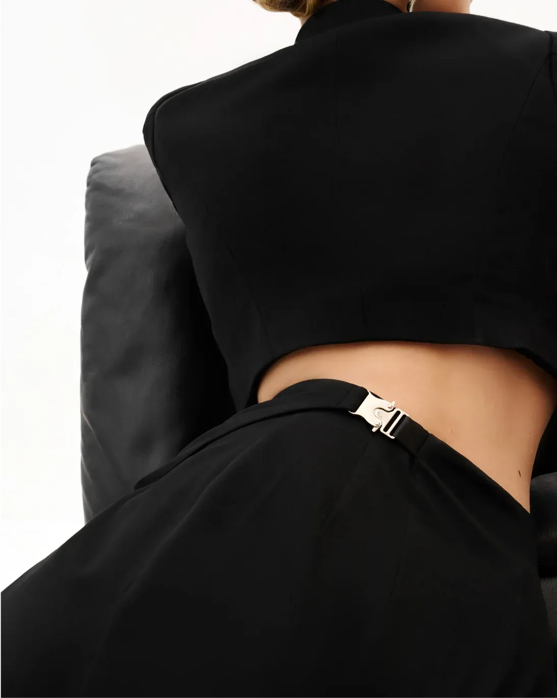
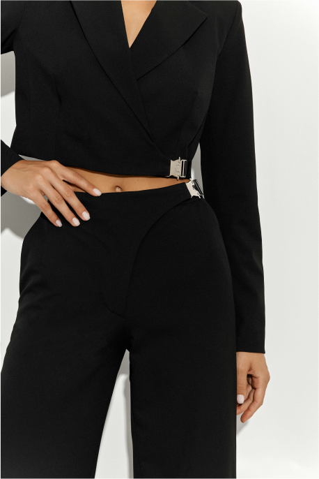
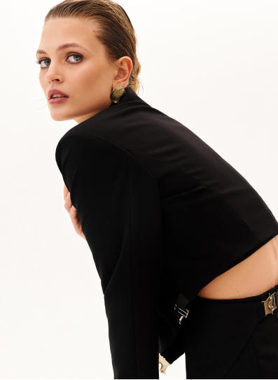
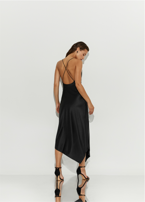
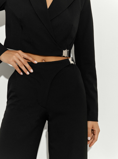
Brand Identity + UX/UI Experience
[email protected]13 mission

To create a strong brand that stood out among other young brands, to overcome the perception of being too serious while still communicating that this is a women's brand for women.
Logo + Brand Identity + Packaging +
Website Development + Visual Content →
Yes, Seriously!
And the result
came out very attractive
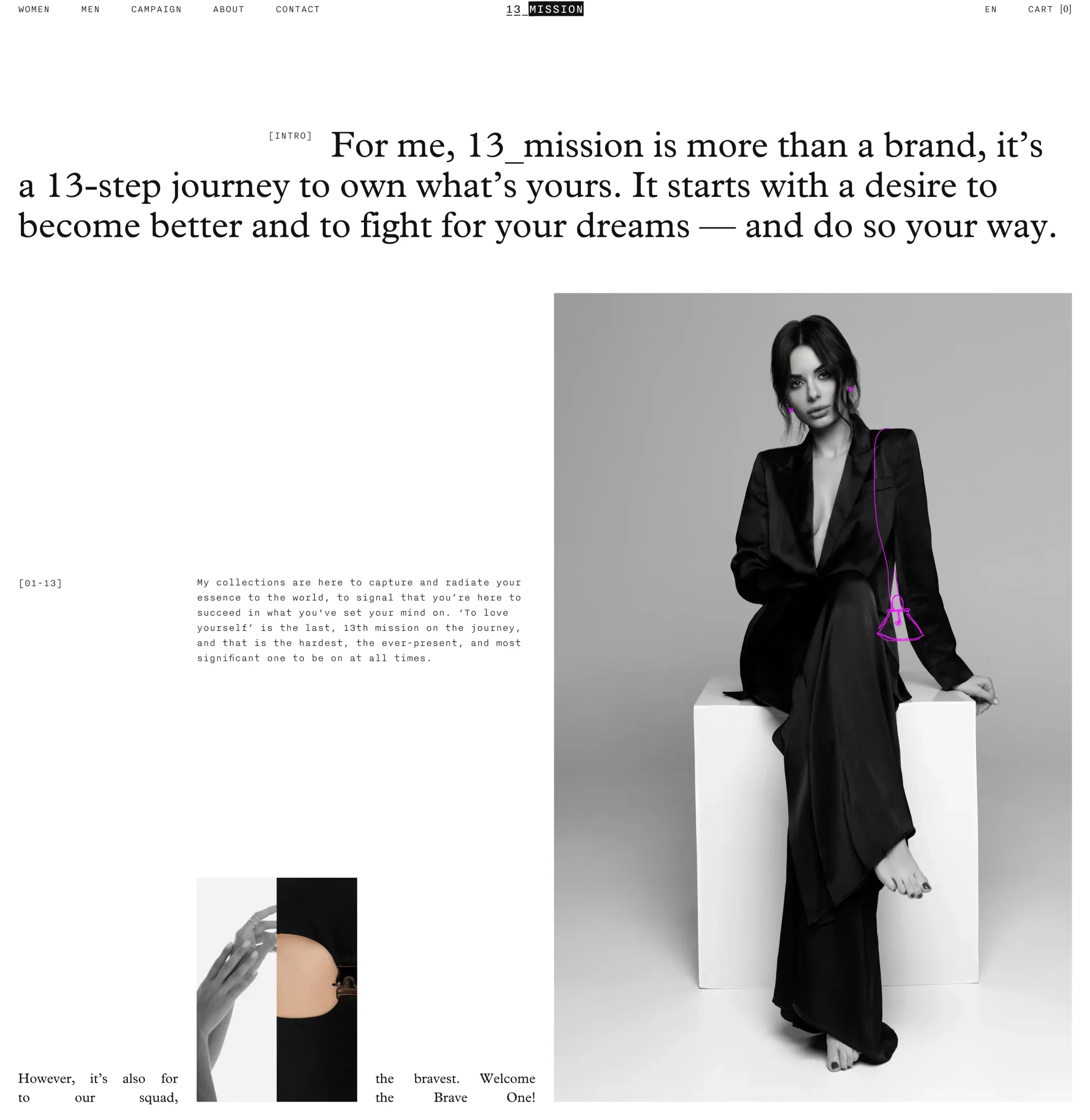
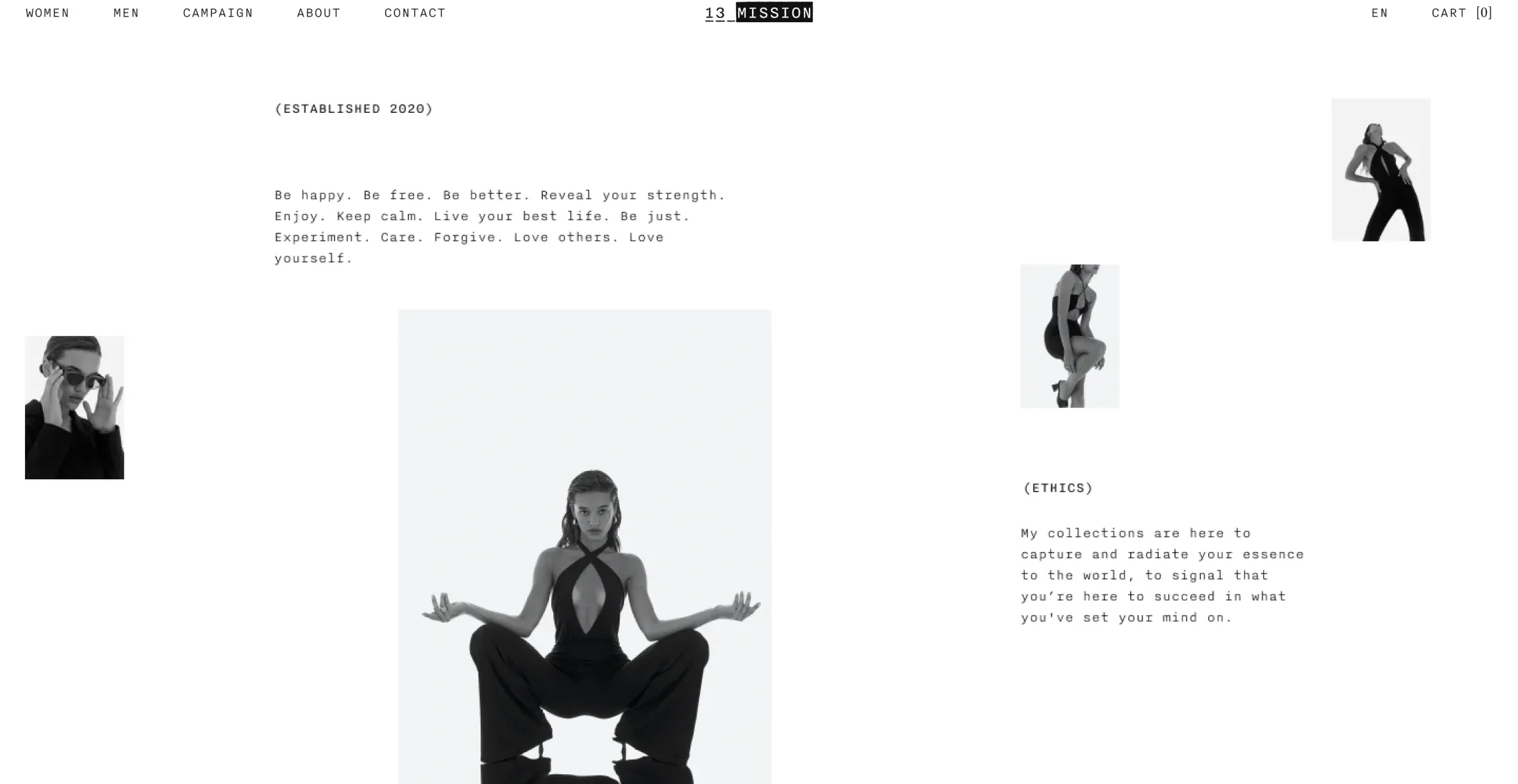
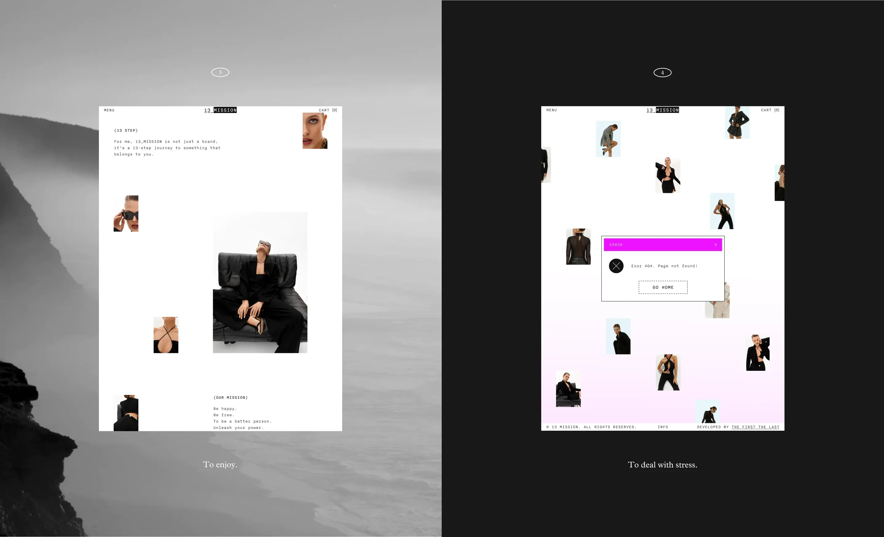
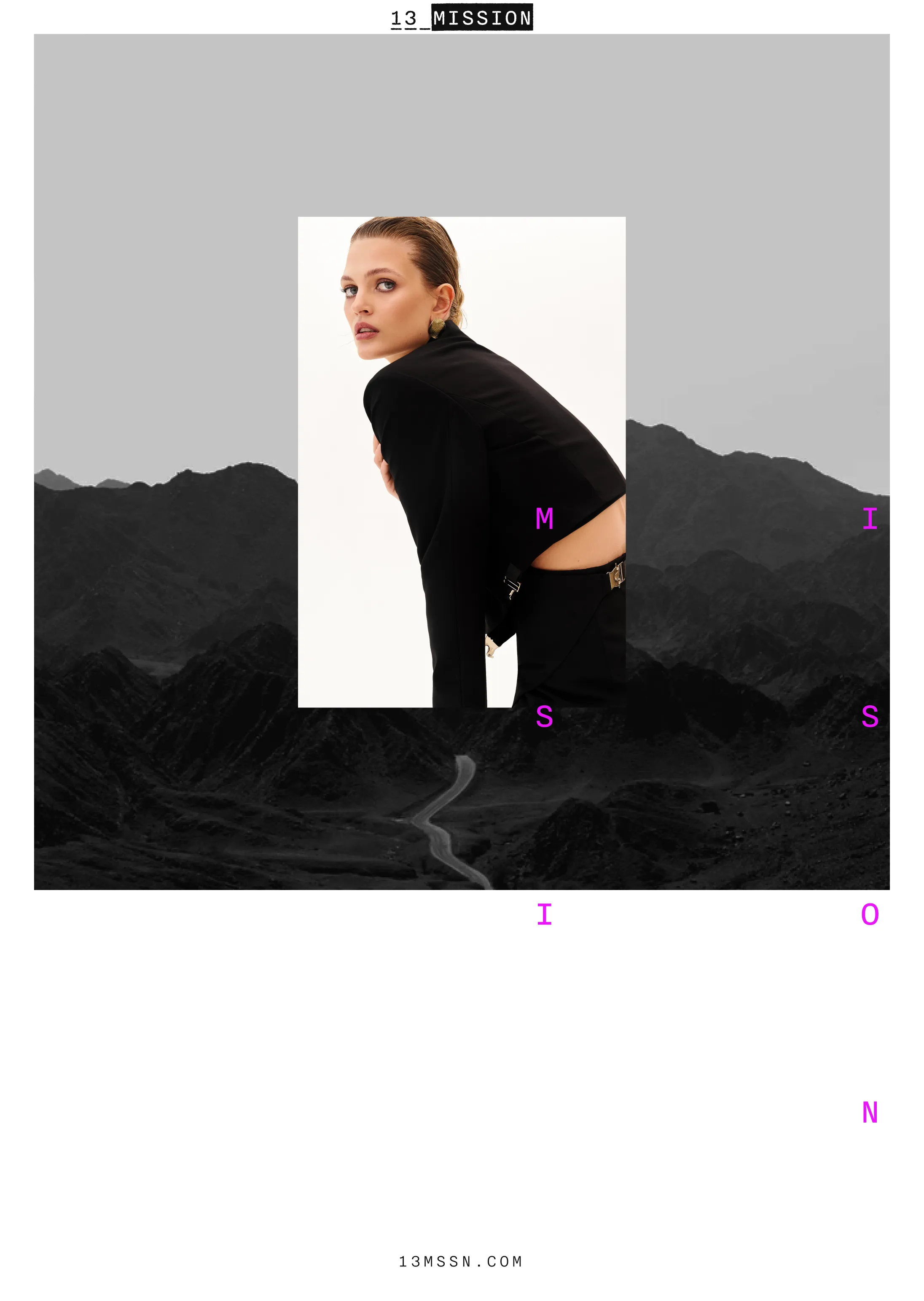
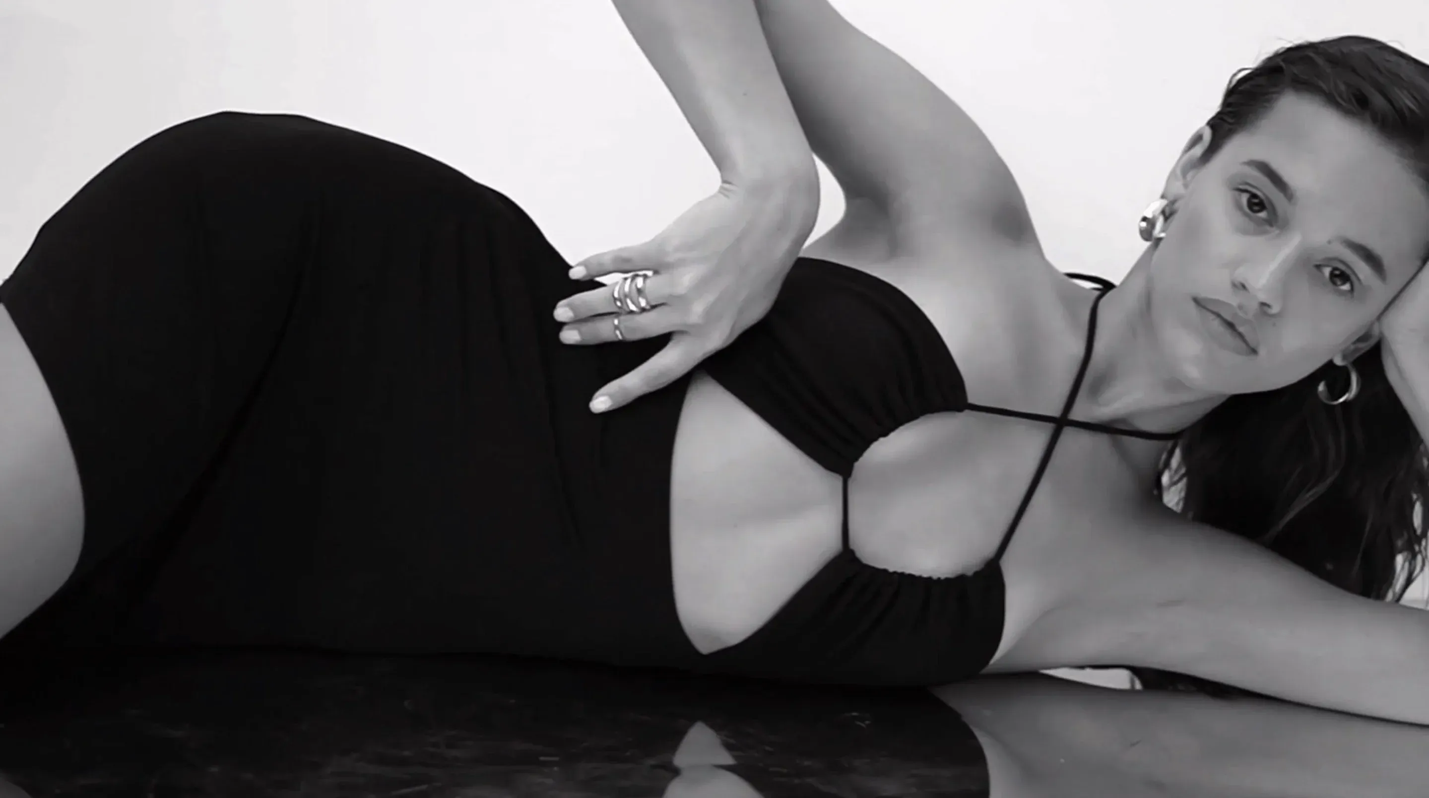
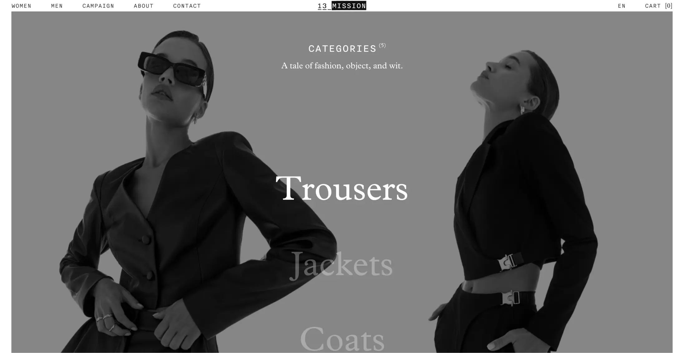
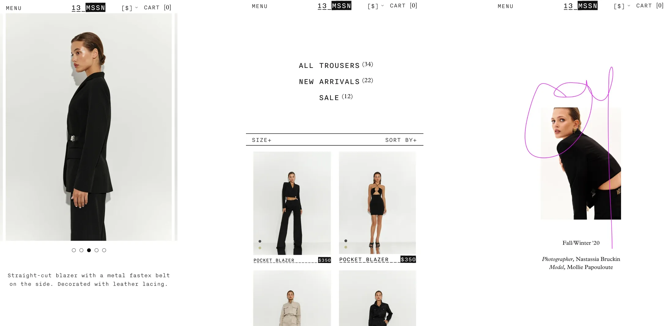
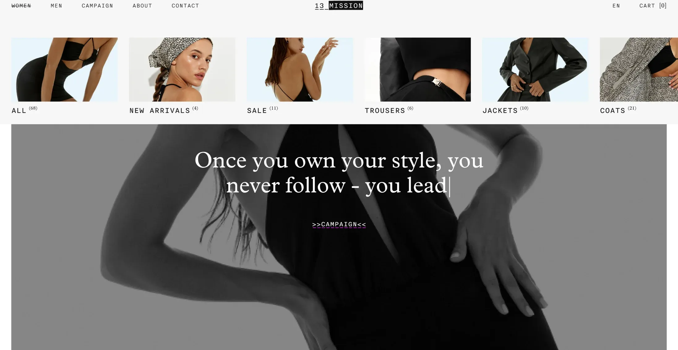
The monospace font, black and white colors were used as a basis. In a couple of cases we took custom fonts with small serifs. The highlight of the branding is pink lines that pass through it, revealing what kind of brand this is to users.
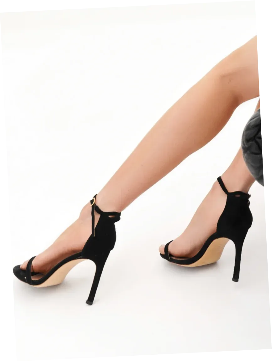
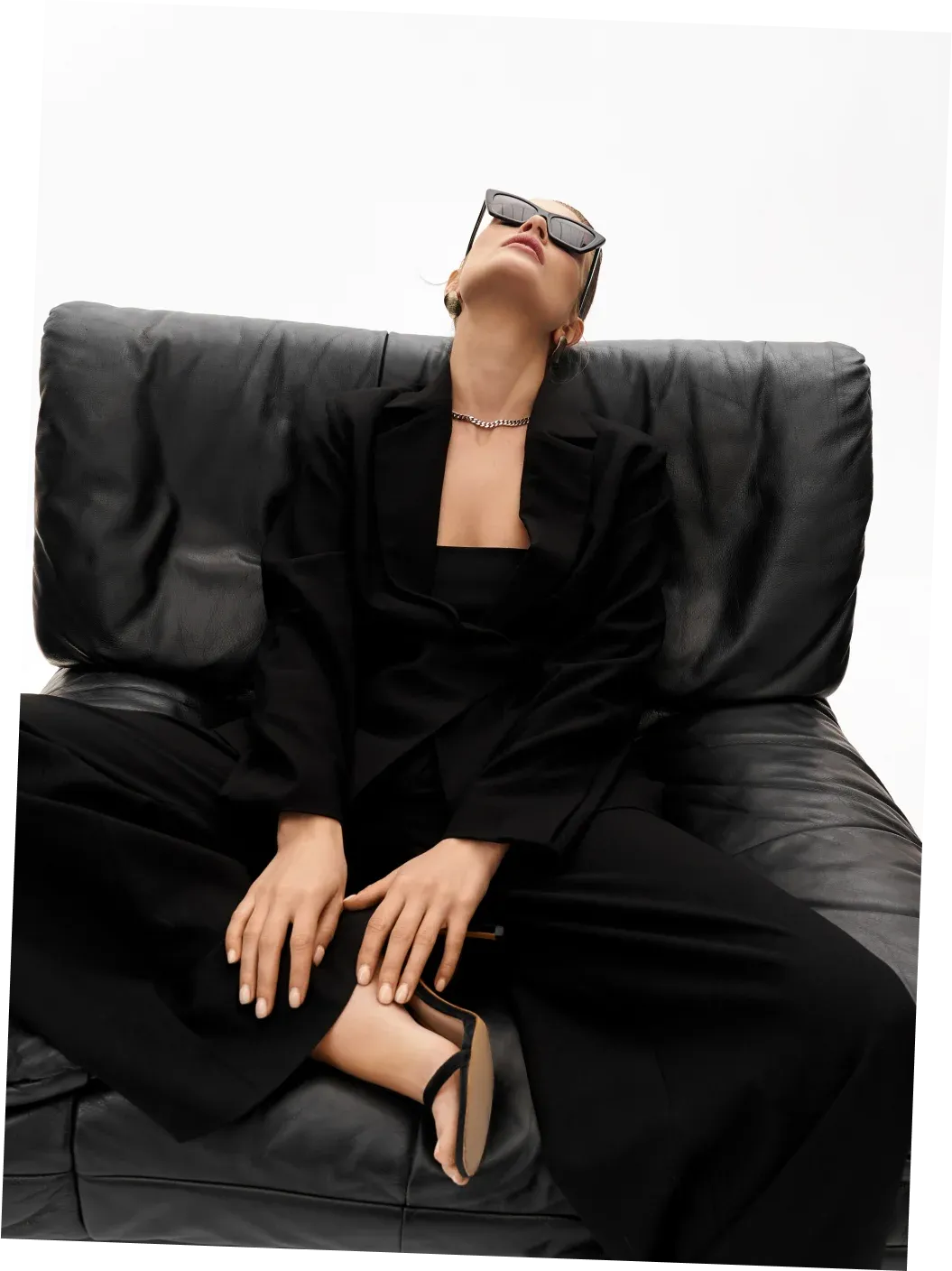
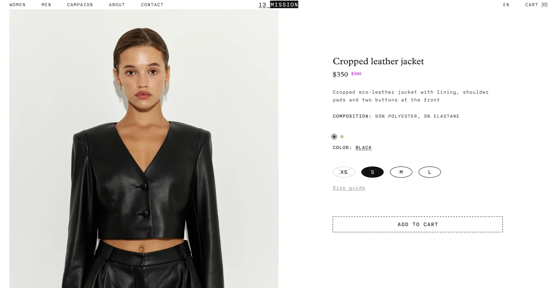
While the site started off minimalist, we decided to showcase the product more prominently than usual. So we omitted extraneous details. The main page —which is unusual in that it doesn't use standard eCommerce blocks, boasts an excellent design to highlight our product and its feature.
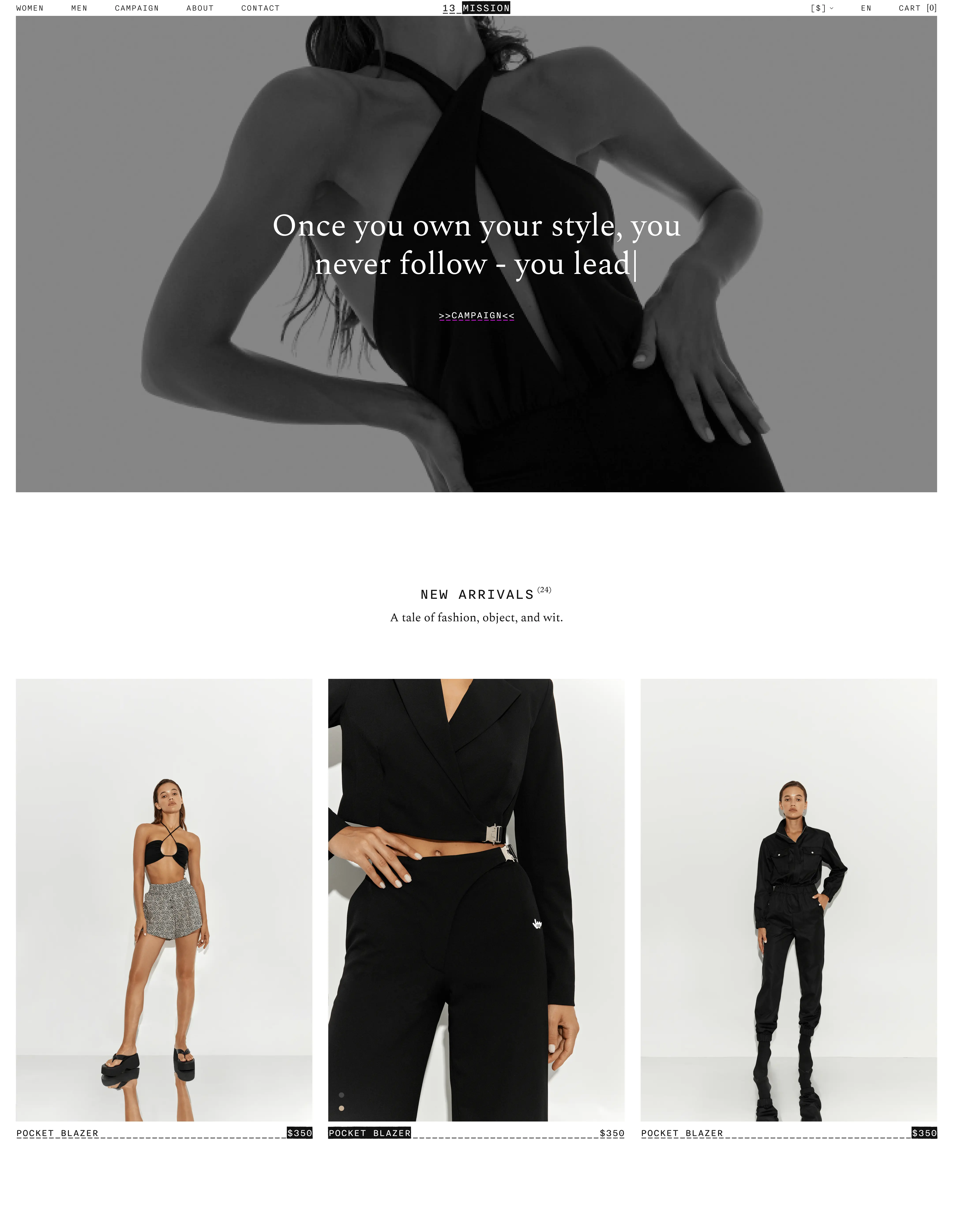
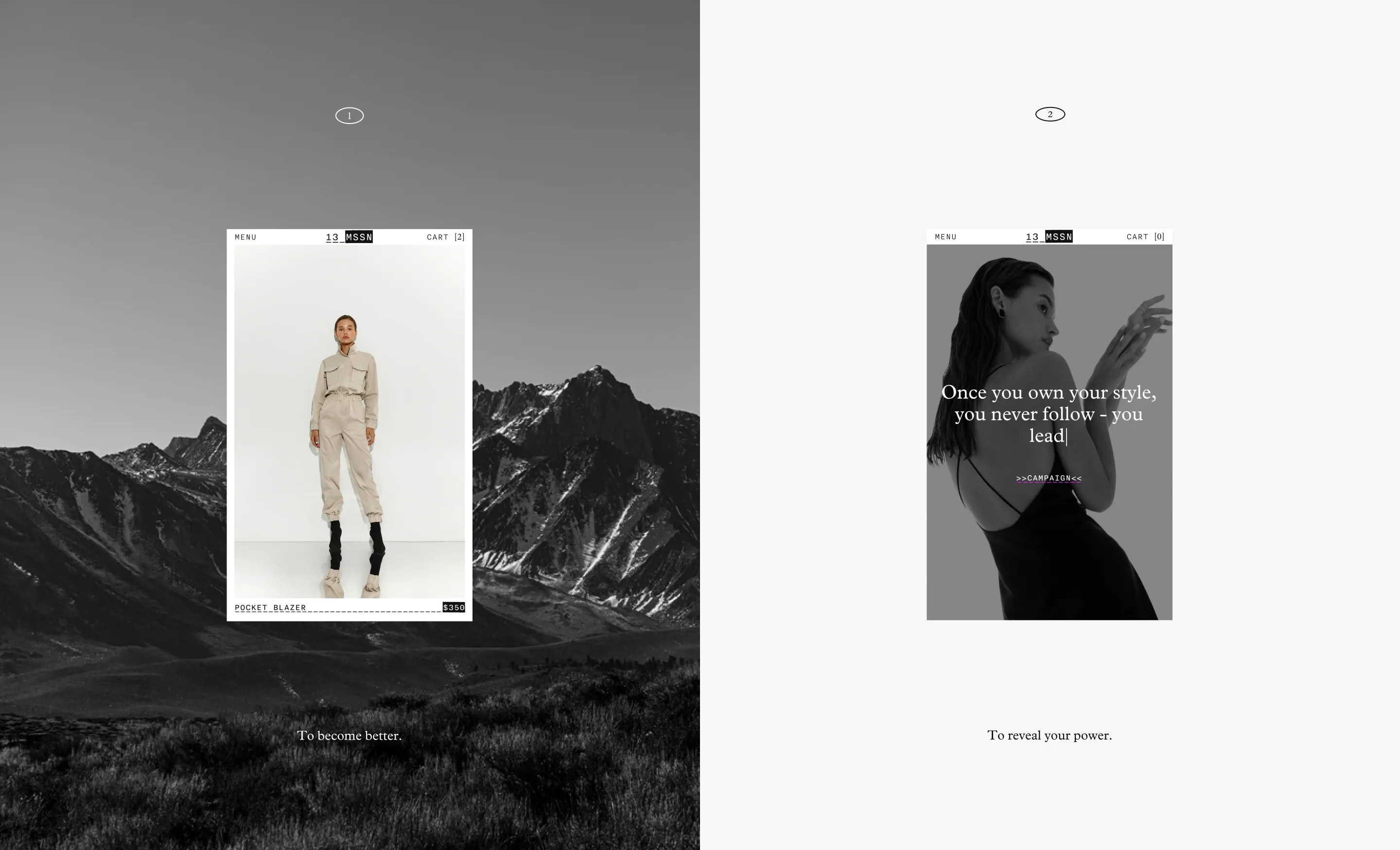
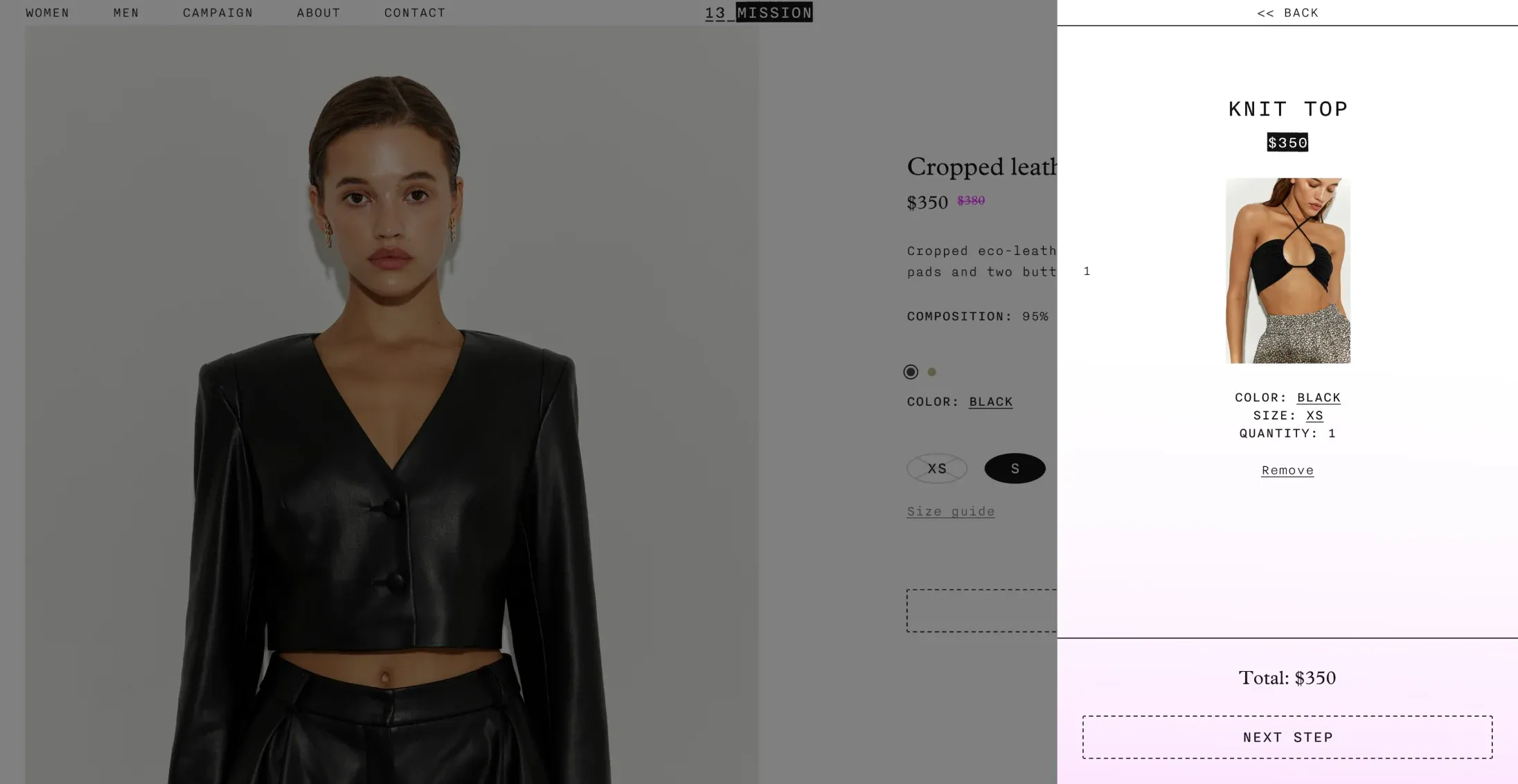
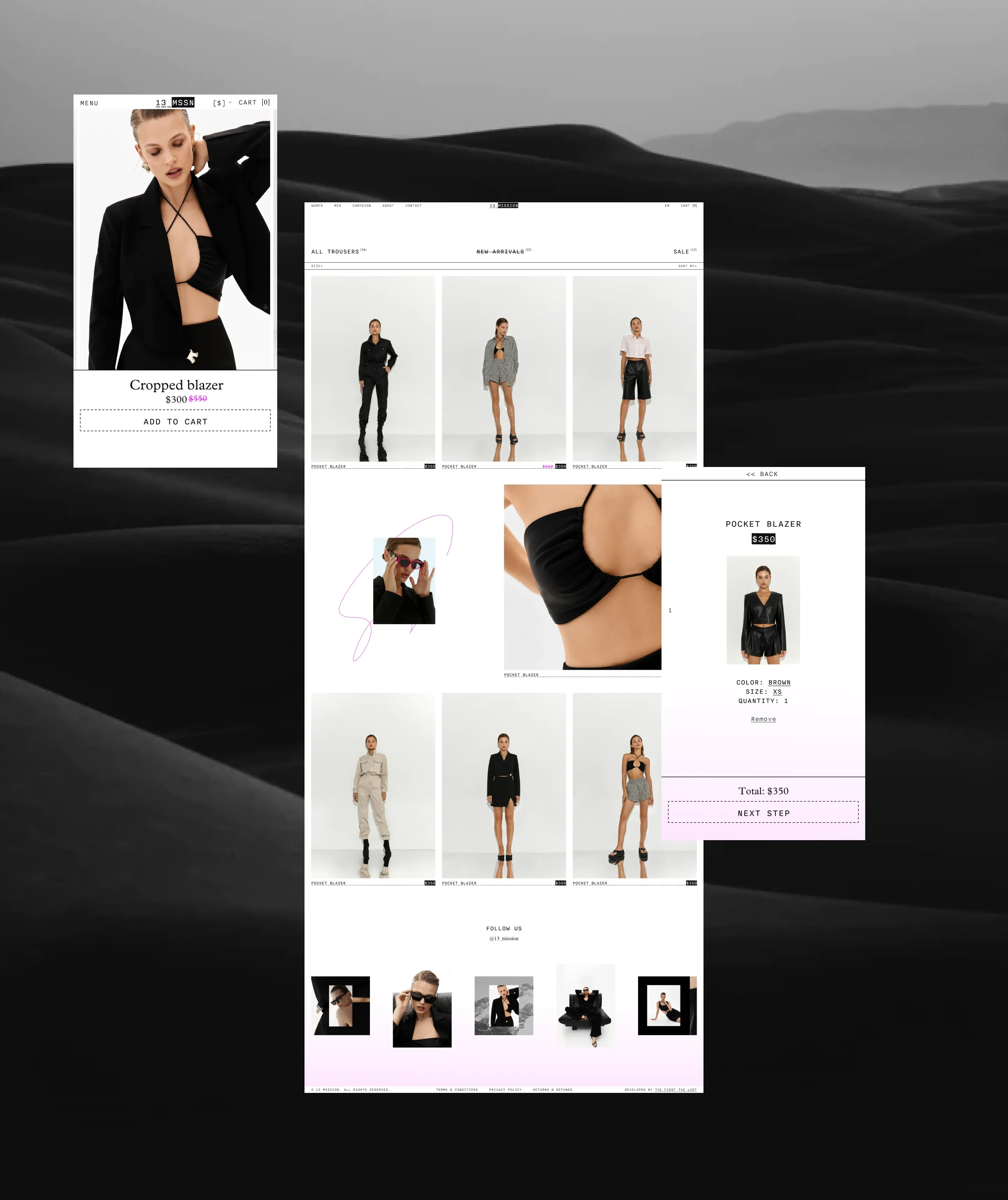
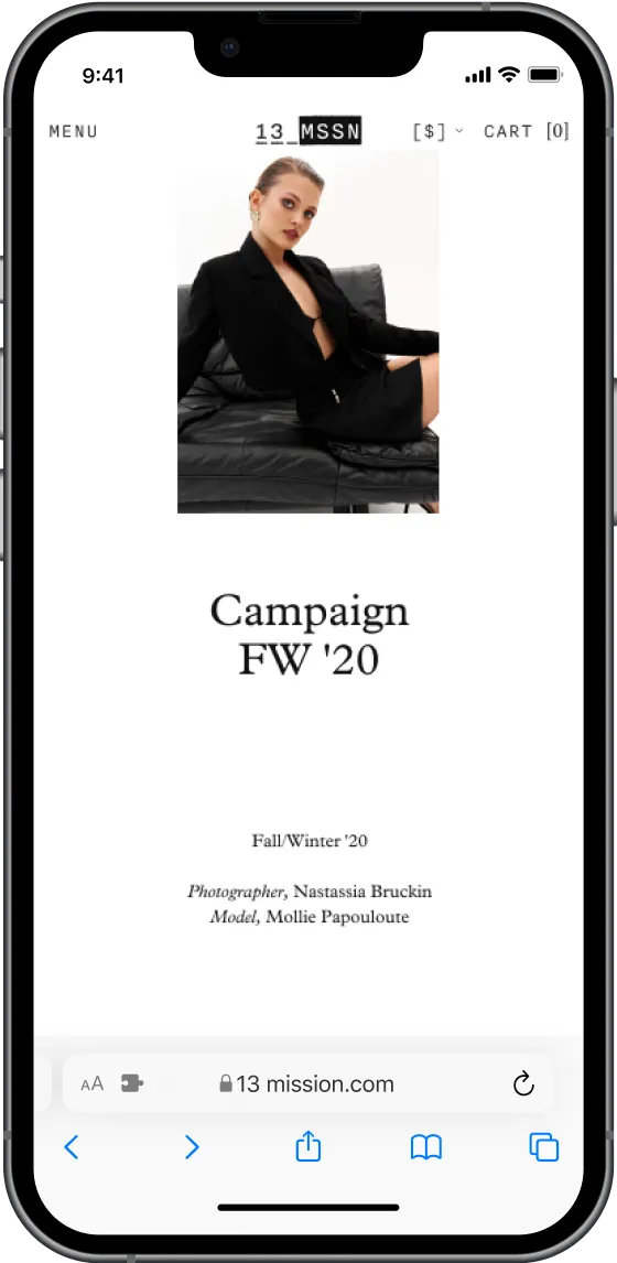
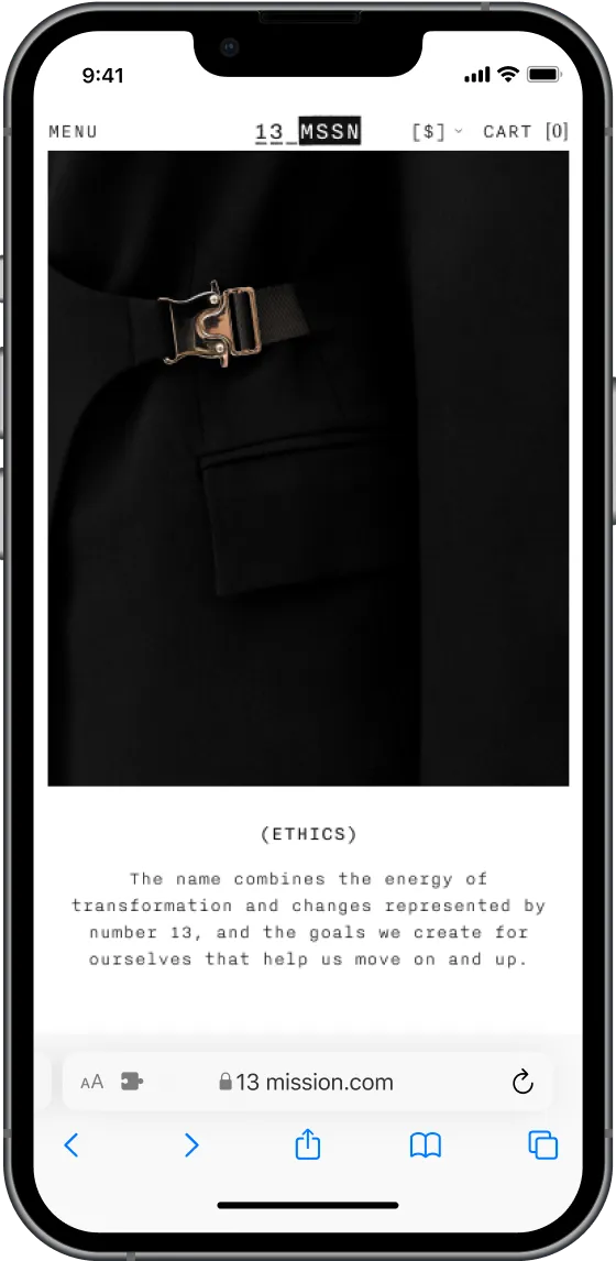
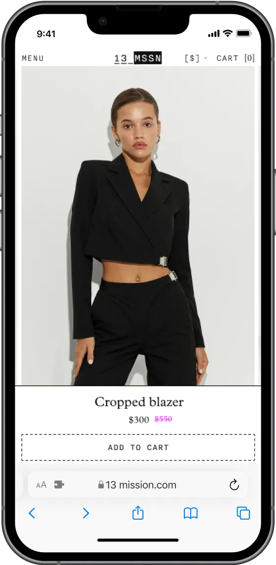
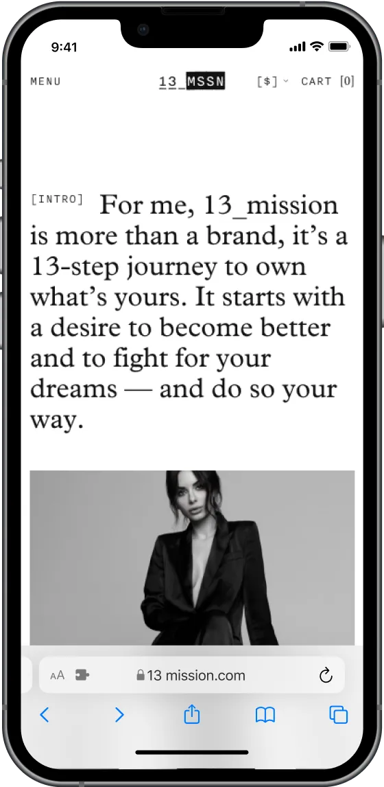
We planned that the client would be satisfied not only with the quality of the brand's items, but also with attention to detail in all aspects.
